CTA placement informational content testing is one of the highest-leverage CRO activities available to content teams — yet most blogs still default to a single end-of-post button and call it a strategy. This benchmark ranks the five most commonly tested CTA formats — inline text links, exit-intent overlays, sticky bars, end-of-post blocks, and sidebar units — across five conversion-critical dimensions so you can stop guessing and start deploying what the data actually supports.
How We Evaluated CTA Placement for Informational Content Testing
Informational content occupies a fundamentally different psychological space than transactional pages. A reader landing on a how-to guide or explainer post is not in buying mode — they are in learning mode. This distinction is the reason why CTA strategies that perform brilliantly on product pages can actively harm conversion rates when transplanted into editorial content without modification. The formats and triggers that work here must acknowledge reader intent rather than fight it.
To build this benchmark, we synthesized patterns from practitioner-reported split tests, documented CRO case studies, and behavioral data shared across the conversion optimization community. Each CTA placement format was scored across five dimensions that matter specifically for informational content: conversion lift potential (the realistic ceiling on click-through and lead generation improvement), UX disruption (how much the format interrupts reading flow and risks bounce), intent fit (alignment with informational reader psychology), implementation complexity (time and technical overhead), and mobile performance (how the format degrades or holds up on small screens). Scores run from 1 to 10, with 10 representing best-in-class performance on that dimension.
For a broader strategic foundation before diving into specific placements, the informational page CTA strategy framework is worth reading first — it covers how to match offer types to reader intent stages, which directly influences which format you should even be testing in the first place.
"The single most common CTA mistake in content marketing is treating informational posts like landing pages — same urgency, same interruption, same mismatch between what the reader came for and what they're being asked to do."
The scoring methodology prioritizes real-world impact over theoretical elegance. A format that is technically sophisticated but collapses on mobile — where industry data consistently shows more than half of blog traffic now originates — cannot score well regardless of its desktop conversion numbers. Similarly, a format that lifts raw click-through rates by aggressively disrupting reading flow scores lower on intent fit, because aggressive disruption on informational content typically inflates low-quality leads and tanks post-click engagement metrics.
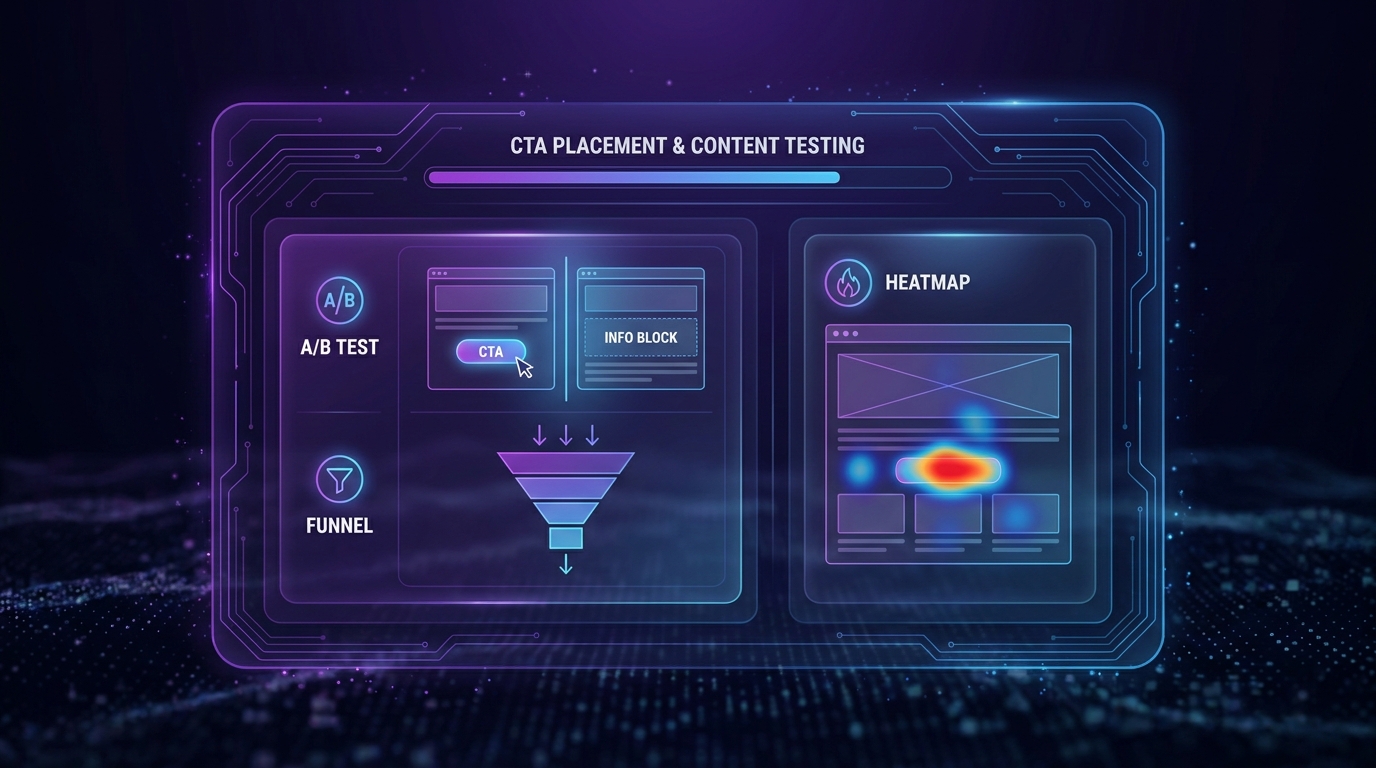
CTA Placement Benchmark Comparison Table: 5 Formats Scored Across 5 Dimensions
The table below scores each format out of 10 per dimension. An aggregate score is provided as a weighted average that gives slightly more weight to conversion lift and intent fit — the two dimensions that most directly determine whether a placement strategy is worth running on editorial content.
| CTA Format | Conversion Lift Potential (out of 10) | UX Disruption (10 = least disruptive) | Intent Fit for Informational Content (out of 10) | Implementation Complexity (10 = easiest) | Mobile Performance (out of 10) | Weighted Aggregate Score |
|---|---|---|---|---|---|---|
| Inline Text CTAs | 7 | 9 | 9 | 8 | 8 | 8.1 |
| Exit-Intent Overlays | 9 | 4 | 5 | 6 | 4 | 6.4 |
| Sticky Bars (Header/Footer) | 6 | 7 | 7 | 7 | 7 | 6.9 |
| End-of-Post CTA Blocks | 6 | 10 | 8 | 9 | 8 | 7.6 |
| Sidebar CTA Units | 4 | 8 | 6 | 8 | 3 | 5.1 |
The aggregate scores reveal a clear hierarchy. Inline text CTAs lead the benchmark not because they generate the highest raw click volume — exit-intent overlays can generate more raw captures — but because they achieve the best balance across all five dimensions. Sidebar units score lowest primarily due to catastrophic mobile performance: most responsive themes collapse the sidebar entirely on small screens, making sidebar CTAs invisible to a majority of blog readers. Exit-intent overlays score highest on conversion lift but pay a steep UX and mobile penalty that pulls their aggregate score down significantly.
Deep Dive: Top CTA Placement Formats for Informational Content
1. Inline Text CTAs — The Clear Benchmark Leader (Score: 8.1)
Inline CTAs are hyperlinked phrases or short sentences embedded within the body copy of a post, typically appearing two to four times throughout a long-form article. Their power comes from context: when a reader is mid-paragraph absorbing information about a specific problem, a naturally phrased link to a related resource or offer feels like a helpful suggestion rather than an interruption. This is the closest any CTA format gets to conversational recommendation, which is precisely why intent fit scores so high at 9 out of 10.
Implementation is straightforward — a well-placed anchor tag with deliberate anchor text is all that is technically required — but the copywriting demands are real. Inline CTAs fail when they read like ad placements rather than logical next steps. The phrase needs to flow grammatically from the surrounding sentence and point toward something that genuinely extends the reader's understanding or solves the adjacent problem they are already thinking about. Many practitioners report that testing three to five different inline placements within a single post — varying both position and phrasing — produces measurable lift compared to a single inline mention.
Pros: Zero additional page elements required, highest intent alignment, works natively on mobile, easy to A/B test via content edits. Cons: Dependent on copywriting quality, can be overlooked by skim readers who don't read body copy linearly, lower visual salience than button-based CTAs.
2. End-of-Post CTA Blocks — The Safe Default Done Right (Score: 7.6)
End-of-post CTA blocks are the format most blogs already use, but they are rarely implemented with the deliberate intent required to maximize their scored potential. The format earns a perfect 10 for UX disruption — it adds nothing to the reading experience because it only appears after the content has been fully consumed — and an 8 for intent fit because a reader who has scrolled to the bottom of an informational post has self-selected as engaged. That engagement signal makes the bottom of the page a genuinely high-intent conversion zone, not a graveyard.
The failure mode is generic execution. A boilerplate "Sign up for our newsletter" box or a mismatched product pitch that has no connection to the specific topic just read produces predictably weak results. End-of-post blocks perform best when the offer is directly related to the post's topic — a downloadable checklist that summarizes the key steps covered, a free tool that implements the framework just explained, or a related content upgrade. Personalization at this position, even lightweight personalization based on the post's category tag, consistently outperforms static global CTAs in practitioner-reported tests.
Pros: Zero disruption to reading experience, captures naturally engaged readers, easy to implement across any CMS, mobile-friendly by default with proper responsive design. Cons: Misses readers who don't scroll to the end (a significant share of informational post traffic), requires topic-specific copy to perform above baseline, invisible to low-dwell-time visitors.
3. Sticky Bars — Persistent Visibility Without Aggressive Interruption (Score: 6.9)
Sticky bars — thin notification-style strips fixed to the top or bottom of the viewport — offer persistent visibility without the psychological aggression of a full overlay. A reader can ignore a sticky bar throughout their entire session, but the message remains available as ambient context. This makes them particularly well-suited to CTAs that are not urgently action-required, such as a free resource broadly relevant to the site's topic area or an ongoing promotion. The format scores a 7 for UX disruption because, while it doesn't interrupt reading, it does permanently consume viewport real estate on mobile.
Testing reveals that sticky bars perform significantly better when the message updates based on scroll depth or post category rather than showing a site-wide static message. A bar that changes its copy once a reader has scrolled 60% through a post — shifting from a generic brand message to something specific to the content just consumed — can achieve conversion rates two to three times higher than a static global variant, according to patterns reported across CRO practitioner communities.
Pros: Persistent visibility throughout reading session, less psychologically aggressive than overlays, good for brand-building offers. Cons: Occupies permanent screen real estate on mobile, requires dynamic content logic to reach its potential, low salience on desktop where readers learn to ignore fixed UI elements.
4. Exit-Intent Overlays — High Ceiling, High Risk (Score: 6.4)
Exit-intent overlays trigger when behavioral signals — cursor movement toward the browser chrome on desktop, or rapid scroll-up on mobile — suggest an imminent page departure. The conversion lift ceiling is genuinely high: many practitioners report this as their highest-volume lead capture mechanism on content pages when measured in absolute numbers. The 9 out of 10 conversion lift score reflects this real ceiling. But the UX disruption score of 4 reflects an equally real risk — poorly configured or overly aggressive exit overlays consistently appear in reader satisfaction complaints and can increase bounce rates when triggered too early or shown to returning visitors who have already converted.
The intent fit score of 5 reflects the fundamental tension in this format for informational content specifically: a reader leaving an informational post may simply be done reading, not interested in converting. Triggering an overlay at that moment asks them to change their intent, which works on a meaningful minority but actively annoys the majority. The highest-performing implementations use exclusion logic to suppress the overlay for readers who have already converted, limit frequency to once per session per unique user, and offer something that specifically addresses why a reader might leave without acting — such as a downloadable version of the content they just read.
Pros: Highest raw conversion volume ceiling of all formats, captures readers who would otherwise leave without any engagement, easy to test offers and copy independently of page content. Cons: High UX disruption risk, mobile implementation is technically unreliable, requires sophisticated exclusion logic to avoid damaging repeat visitor experience.
5. Sidebar CTA Units — Lowest Aggregate Score, Specific Use Cases Remain Valid (Score: 5.1)
Sidebar CTAs score lowest overall, primarily because they are invisible on mobile for the majority of responsive blog implementations. This single structural problem caps their realistic reach at whatever percentage of your audience uses desktop browsers — a shrinking minority for most content sites. On desktop, sidebar units do capture passive awareness from readers who glance left or right during reading, but eye-tracking research consistently shows that readers habituate to sidebar content quickly and develop what practitioners call "banner blindness" for that page zone.
The format is not without value in specific configurations. For content sites where desktop traffic remains dominant — certain B2B technical blogs, for instance, where readers are on work computers — a well-designed sidebar card with a contextually relevant offer can outperform a generic end-of-post block. The key is treating the sidebar as a supplementary channel rather than a primary conversion mechanism, and ensuring the sidebar content is category-specific rather than globally static.
Pros: Consistently visible throughout scroll on desktop, low implementation overhead, works well as a supplementary format alongside primary CTAs. Cons: Invisible on mobile for most blog implementations, high banner blindness on desktop, static global sidebar content performs poorly compared to dynamic alternatives.
Verdict by Profile: Which CTA Placement Format Fits Your Situation
Best for content-first blogs with limited development resources: Inline Text CTAs + End-of-Post Blocks. This combination requires zero additional tooling, works natively across all devices, and can be implemented by any writer with editing access. The inline placement captures engaged mid-read readers; the end-of-post block captures those who reach the conclusion. Start here, test copy variations, and only layer in more complex formats once this baseline is optimized.
Best for lead generation-focused content operations: Exit-Intent Overlays configured with strong exclusion logic. If your primary content goal is list growth and you have the technical infrastructure to implement proper suppression for past converters and repeat visitors, exit-intent will generate the most raw lead captures of any single format. Invest in the configuration — an exit overlay without exclusion logic will damage reader experience faster than it grows your list.
Best for high-traffic informational hubs with diverse audiences: Sticky Bars with scroll-depth triggers + Inline CTAs. High-traffic sites with varied post topics benefit from the persistent visibility of a sticky bar that updates its message based on content category, combined with inline CTAs tailored to each individual post. This combination addresses both broad-intent readers (who may engage with the ambient bar message) and deep-intent readers (who engage with contextually relevant inline prompts).
Best for B2B content with predominantly desktop audiences: Sidebar Units + End-of-Post Blocks + Inline CTAs. If analytics confirm that 60% or more of your traffic is desktop, the sidebar becomes a viable third conversion point rather than a waste of page real estate. Use it for an offer that complements rather than repeats the inline and end-of-post CTAs — for example, a live demo or consultation booking for readers who are further along in their evaluation journey.
Best for maximum tested lift across a content program: All five formats tested sequentially, beginning with inline and end-of-post as baseline, then layering in sticky bar and exit-intent with proper exclusion logic. For teams with dedicated CRO resources, the highest aggregate conversion rates come from running a structured testing roadmap rather than selecting a single winner. The informational content conversion optimization guide provides a systematic framework for running this kind of multi-format content CRO program at scale.
How to Choose: A Decision Framework for CTA Placement Testing
Selecting the right CTA placement format is not a matter of picking the highest-scored format from this benchmark and applying it universally. It requires a structured decision process that accounts for your specific audience, content goals, and technical constraints. The following framework gives you a clear decision path without requiring a deep CRO background to execute.
Step 1 — Audit your current traffic split by device. Open your analytics platform and determine what percentage of your blog traffic is mobile vs. desktop. If mobile exceeds 55%, immediately deprioritize sidebar CTAs entirely and configure any sticky bar tests specifically for mobile UX. This single data point eliminates whole categories of wasted testing effort.
Step 2 — Clarify the primary conversion goal for your informational content. Are you optimizing for email list growth, gated content downloads, free tool sign-ups, or direct sales pipeline? Different goals suit different formats. Email list growth benefits most from exit-intent and sticky bars. Content download goals are best served by inline CTAs placed immediately after the content problem is defined. Direct pipeline goals require end-of-post blocks with high-specificity copy.
Step 3 — Assess your content-to-offer relevance before testing placement. No placement test will rescue a mismatched offer. Before allocating testing resources to format and position, confirm that the CTA offer is logically connected to the specific post topic. A post about email subject line testing should not primarily CTA to a social media scheduling tool, regardless of where that CTA is placed.
Step 4 — Establish an inline + end-of-post baseline first. These two formats require the least infrastructure and produce clean baseline data. Run them for at least 30 days or until you reach statistical significance. Every more complex format you subsequently test should be benchmarked against this baseline, not against nothing.
Step 5 — Layer in one additional format per testing cycle. Introducing multiple new formats simultaneously makes it impossible to attribute performance changes to any single variable. Add exit-intent in one cycle, sticky bar in another, and track not just click-through rates but downstream conversion quality — lead-to-customer rates, post-click engagement, email open rates for captured addresses. Informational content attracts a wide intent range; the best CTA placement is the one that captures readers who eventually convert, not just those who click.
"Placement is the last variable you should optimize. Match the offer to intent first, write copy that earns the click second, and only then test where on the page that copy should live."
Step 6 — Review and iterate quarterly. Audience behavior on informational content shifts as your topic authority grows and as your traffic mix changes. A placement strategy that worked when 40% of your traffic was organic search may underperform once referral and social traffic grow and bring readers with different intent profiles. Build a quarterly review into your editorial calendar to reassess benchmark performance against updated traffic data.
Frequently Asked Questions
Where should I place a CTA on a long-form informational blog post?
For most informational blog posts, the highest-performing combination is an inline CTA placed within the first 40% of the post body — ideally adjacent to the core problem being addressed — plus a dedicated CTA block at the end of the post. The inline placement captures readers who are actively engaged with the problem, while the end-of-post placement captures those who have read through to the conclusion. A sticky bar adds a third persistent touchpoint without disrupting reading flow.
Do exit-intent popups hurt SEO or user experience signals on blog content?
Exit-intent overlays do not directly hurt SEO rankings when implemented correctly, since they trigger on departure intent rather than on page load and are therefore distinct from intrusive interstitials. However, poorly configured overlays that trigger too early or repeat for returning visitors can increase bounce rates and reduce dwell time, which are engagement signals worth monitoring. The key safeguards are suppressing the overlay for users who have already converted, limiting frequency to once per session, and ensuring the overlay is not triggered within the first 30 seconds of a visit.
How many CTAs should a single blog post have?
Industry practice converges on two to four CTA touchpoints per long-form informational post as the functional range — enough to capture readers at different stages of engagement without creating an experience that feels like an obstacle course. For posts under 1,000 words, one inline CTA and one end-of-post block is typically sufficient. For posts over 2,000 words, two to three inline CTAs distributed across the post length plus an end-of-post block represents an effective density that doesn't degrade reading experience.
What is the best CTA format for mobile blog readers?
Inline text CTAs and end-of-post blocks are the two formats that perform most reliably on mobile because they are native to the content flow and don't require additional UI elements that may render poorly on small screens. Sticky footer bars — as opposed to sticky header bars, which obscure reading content — can also perform well on mobile when they are dismissible and confined to a small height. Sidebar CTAs and full-screen exit-intent overlays on mobile are the two formats most likely to degrade mobile experience and should only be deployed with careful mobile-specific configuration.
How do I test CTA placement without a dedicated CRO tool?
You can run meaningful CTA placement tests using only your CMS and a basic analytics platform. The simplest method is to create two versions of the same post — one with an inline CTA only, one with an end-of-post block only — and split traffic between them using date-based or URL-based variants, then compare click-through rates over a minimum 30-day window. Many CMS platforms including WordPress, Webflow, and HubSpot offer native A/B testing for blog content without requiring a separate testing tool. For more sophisticated multi-variable tests, tools like Google Optimize alternatives or built-in CMS personalization features provide additional capability at low cost.